Native iOS and Material Budget App
Tools Used
- Sketch
- InVision
My Contributions
- Competitive Research
- User Stories/Flows
- UI Design
- Mockups
Project Overview
A budgeting app that gives the user just enough information to not overwhelm them! Buney is a finance tracking app that utilizes the native looks of iOS and Material to give a familiar feel to its users. Closely followed guidelines by iOS and Material to create a app that can be used on both operating systems.
Research
Buddy
This is a very attractive tracking app that has a great UI that goes very deep into data. It has great flows and follows a lot of iOS guidelines but it has a few confusing areas in the UI. I like to use this app on occasion due to it’s nice feel and UI. I find it very easy to use and pulled inspiration from it.

I found:
- Great uses to gradients and colors
- Excellent input information
- Easy Navigation
- A dark and light mode
EveryDollar
This app was confusing and hard to use, it follows iOS guidlines and has a simple color palette. It had lots of ads. It had good familiar gestures while inputting expenses. It had confusion user flows and unappealing UI.

I found:
- Confusing menues
- Constant Pressure to upgrade plan
- Bland design
Ideation
I created 3 user stories so I knew what screens I needed to create and also the experience I have from using the apps I researched. Once I came up with 3 stores that I felt were going to cover the important features of my app I created a user flow for it!
User Stories
1. As a user I want to be able to have a recurring expense for my mortgage each month so I don’t have to enter it every month.
2. As a user I would like to edit previously made transactions so that I can change any of the information about them I originally entered.
3. A user is on the home page of the app and would like to change one of the three main graphs shown at the top of the page.
User Flow
Low Fidelity Wireframes
These wireframes were created in Balsamiq. Once I was happy with the screens I had created to get the basic foundation I moved onto Mid Fidelity Wireframes!
Mid Fidelity Wireframes
High Fidelity Wireframes
Validation
User Testing
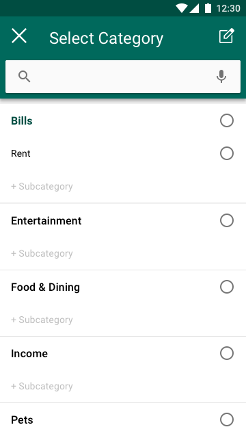
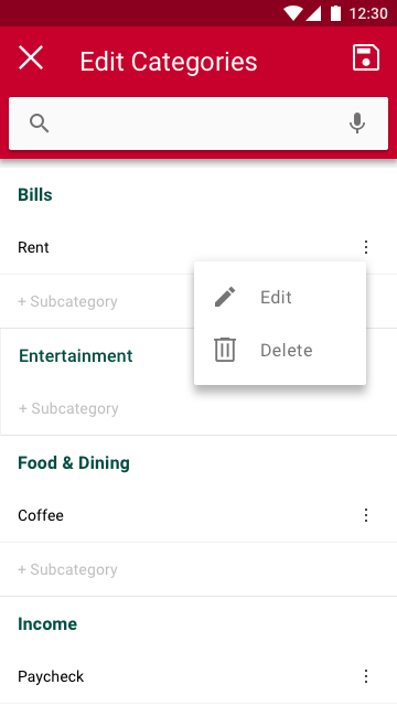
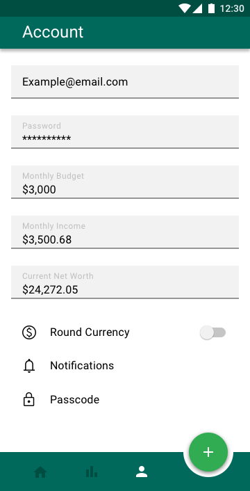
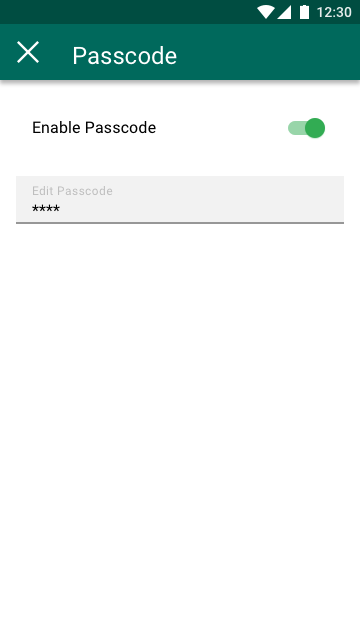
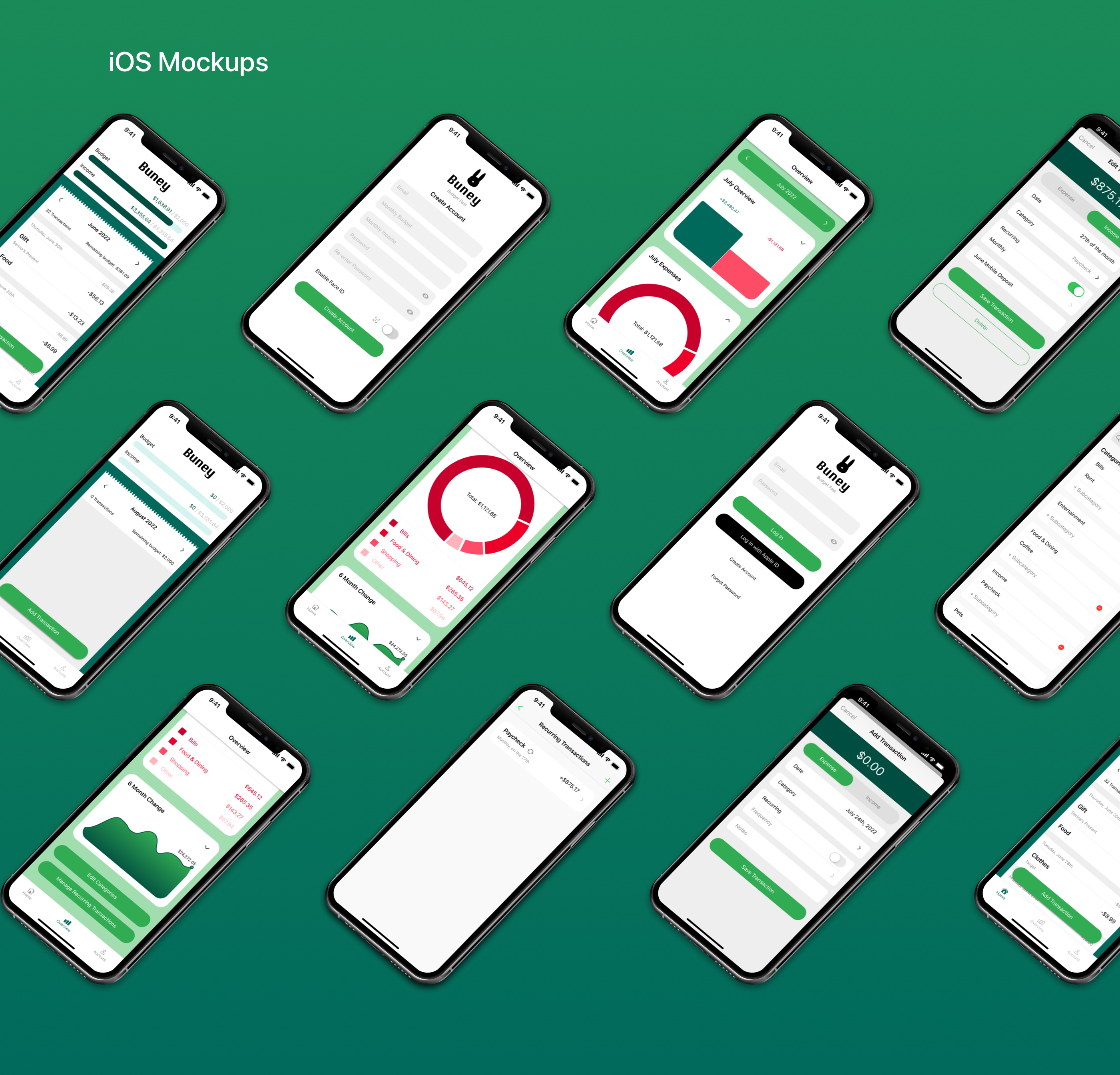
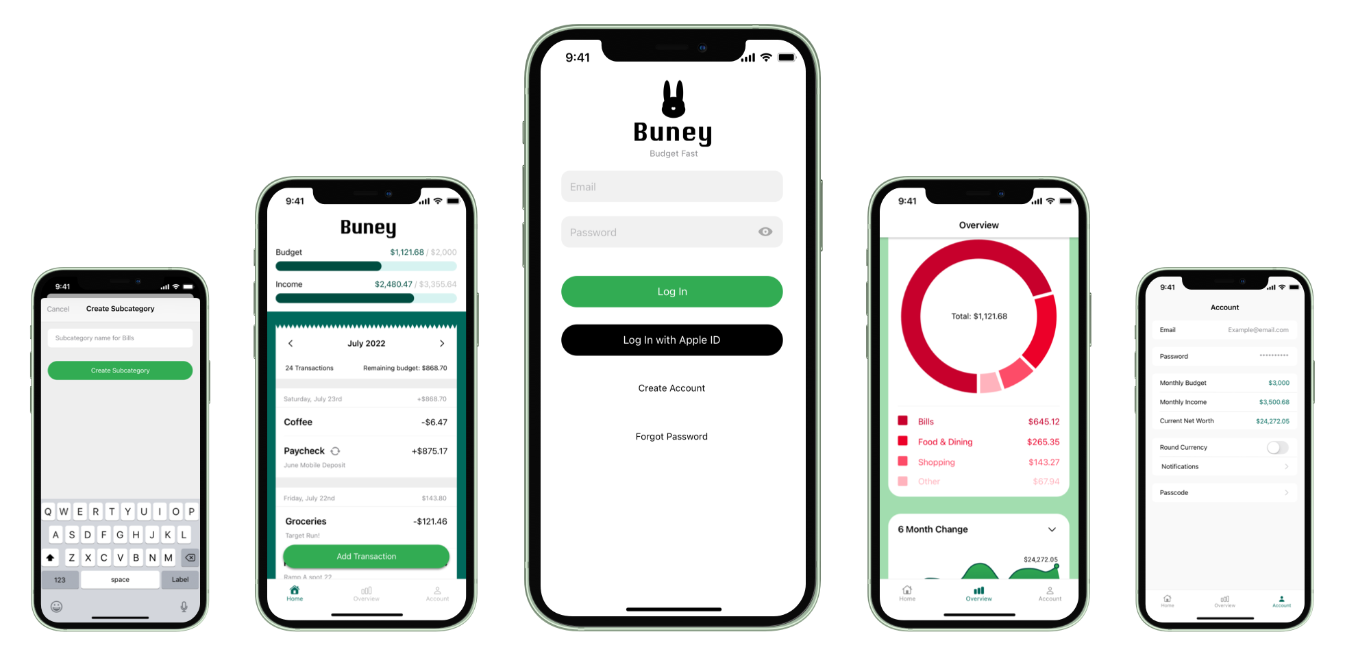
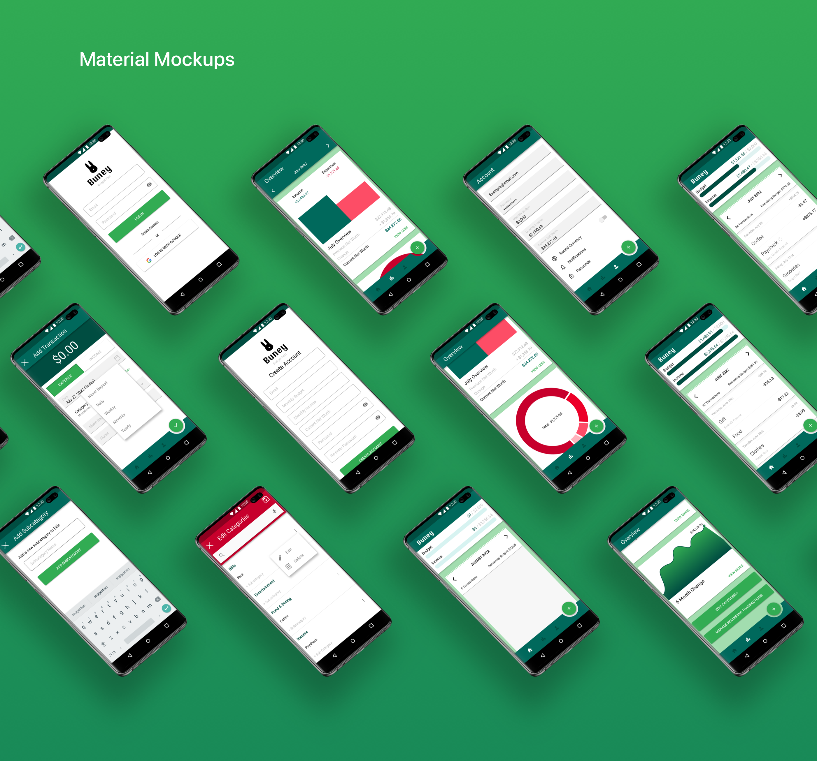
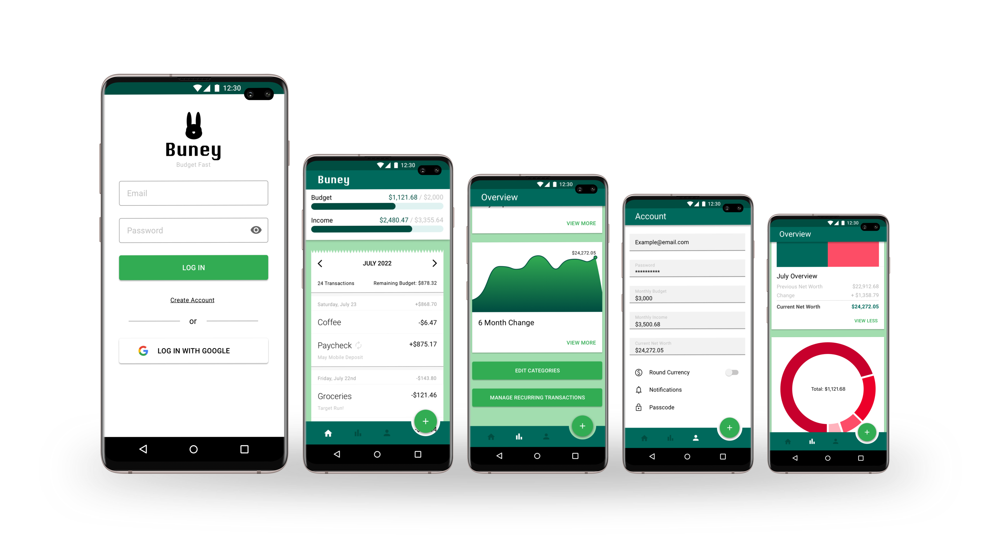
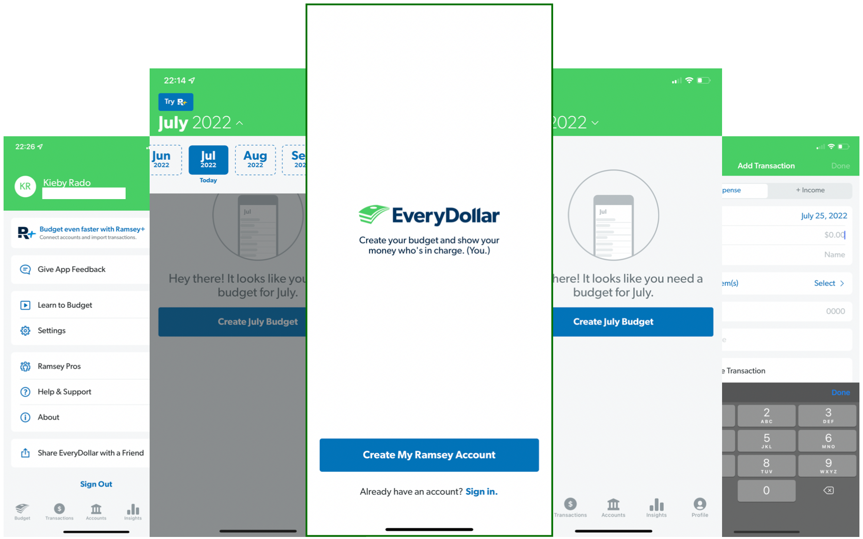
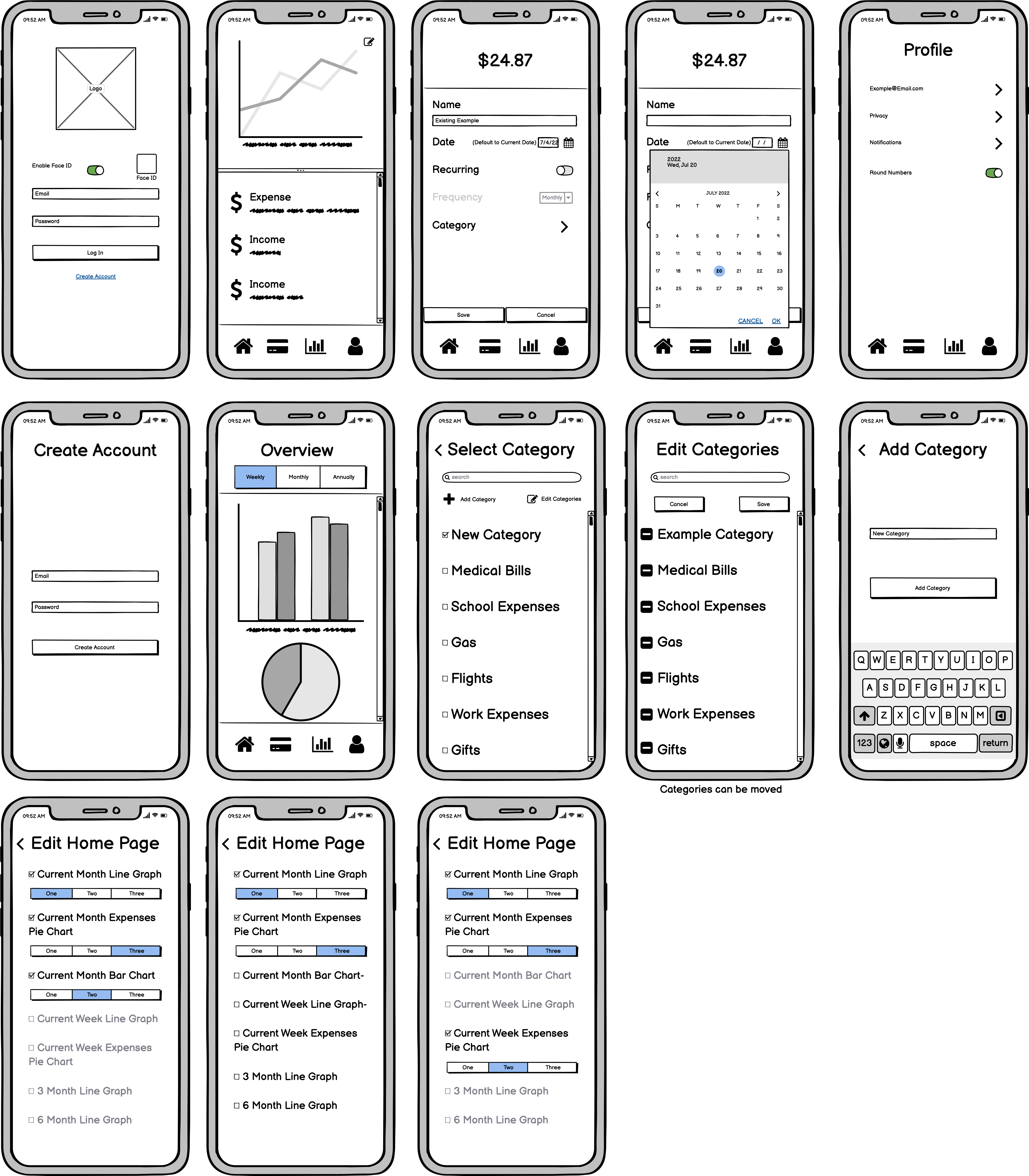
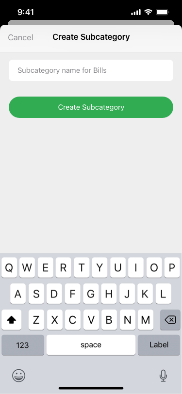
I created an iOS and Material prototype using Sketch and InVision that includes gesture controls that you can access at the in the links below. I got fantastic feedback from 5 people including other CareerFoundry students also studying UI Design. I made of list of the critiques and went through and changed the ones I agreed with to make my Budget app even better.
Changes Made
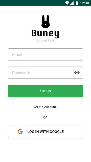
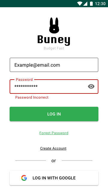
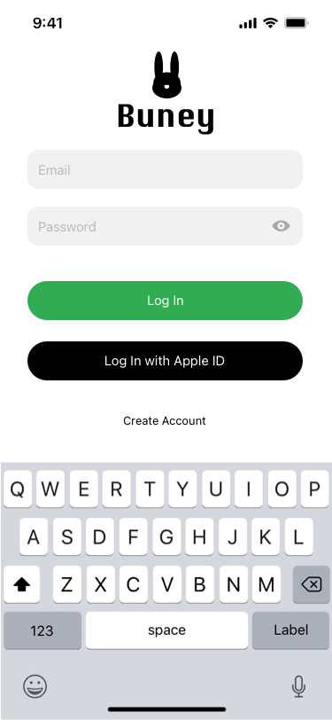
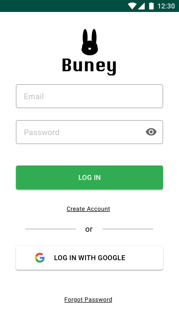
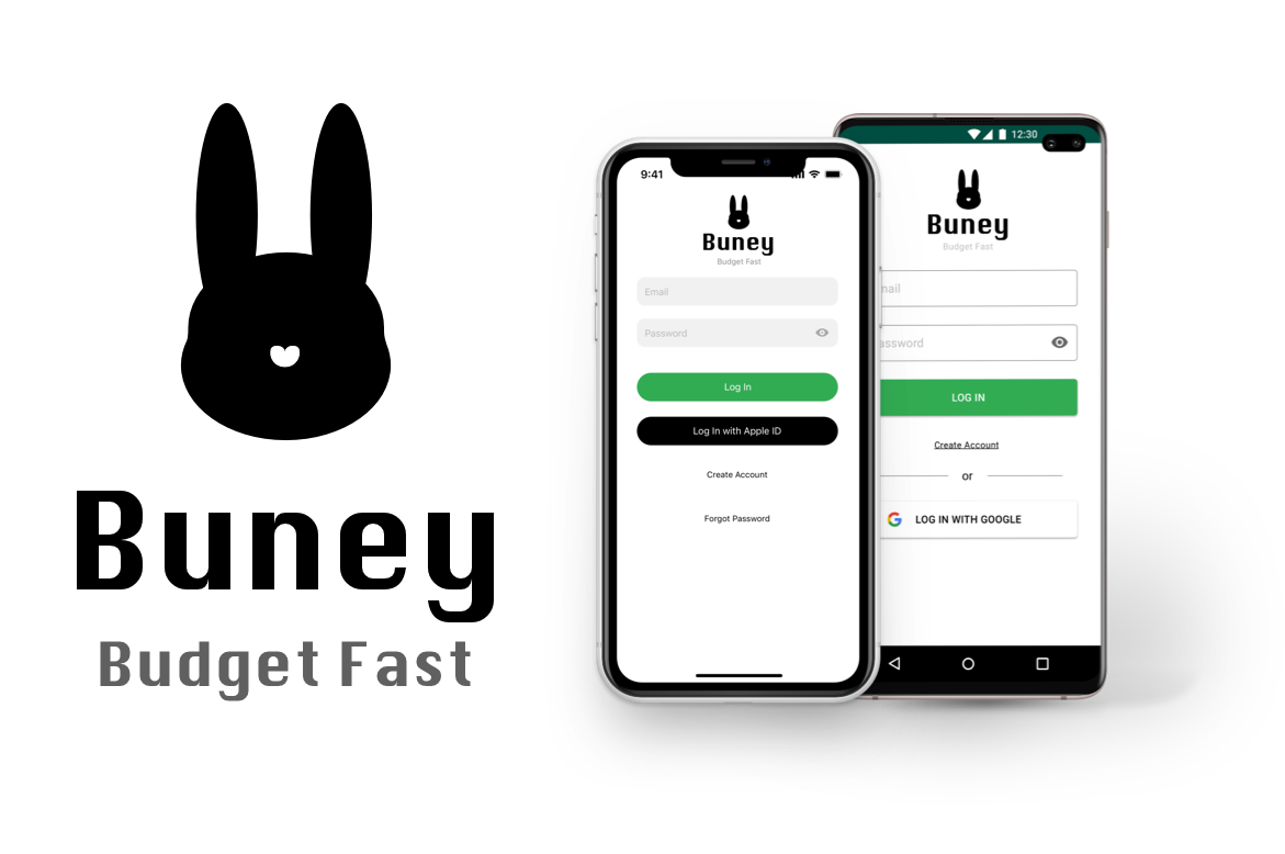
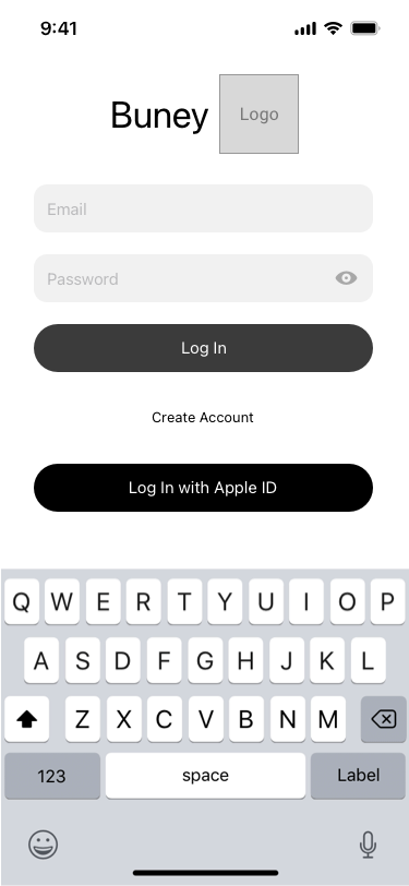
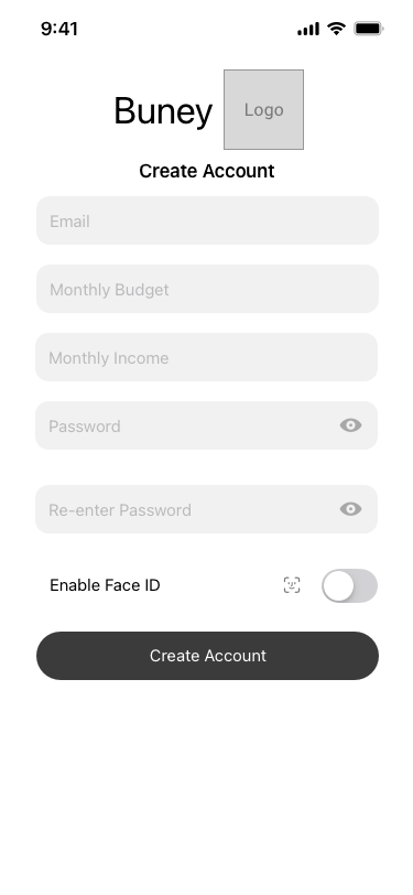
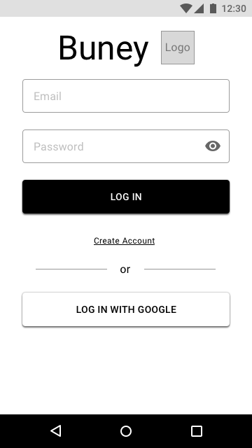
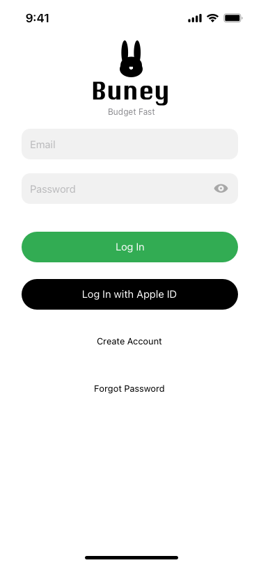
1. Added subtext to login screen “Budget Fast” to give users context for what the app is used for.
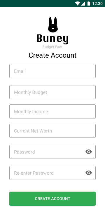
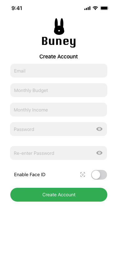
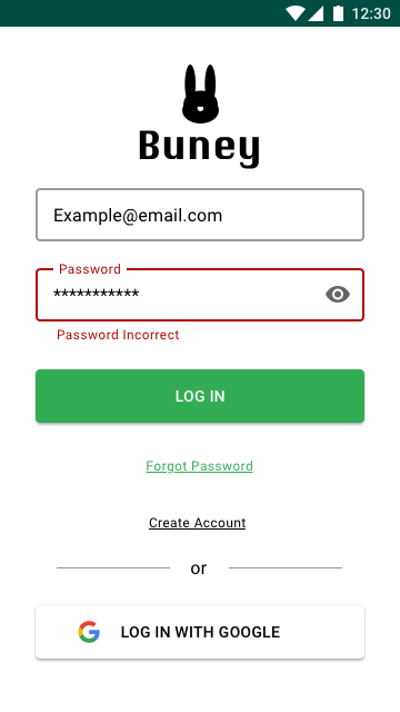
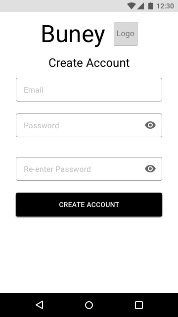
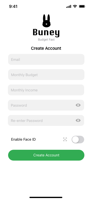
2. Evened spacing between password and re-enter password text fields to decrease user confusion.
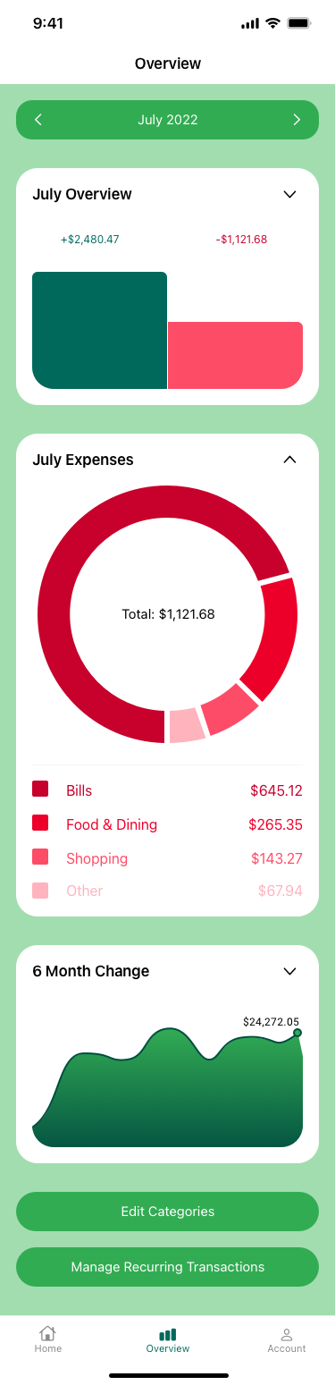
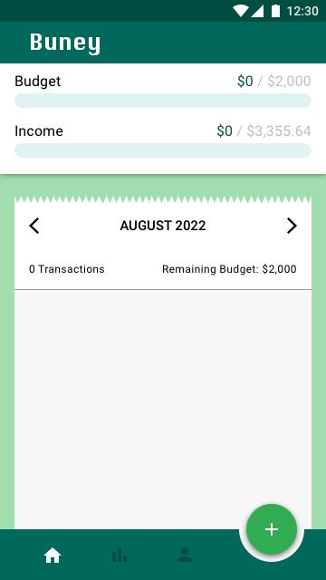
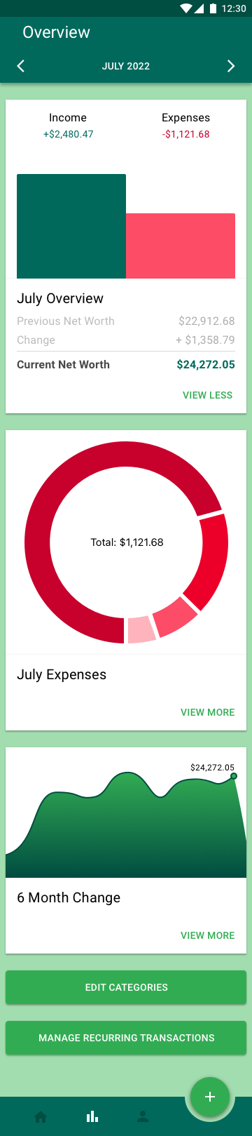
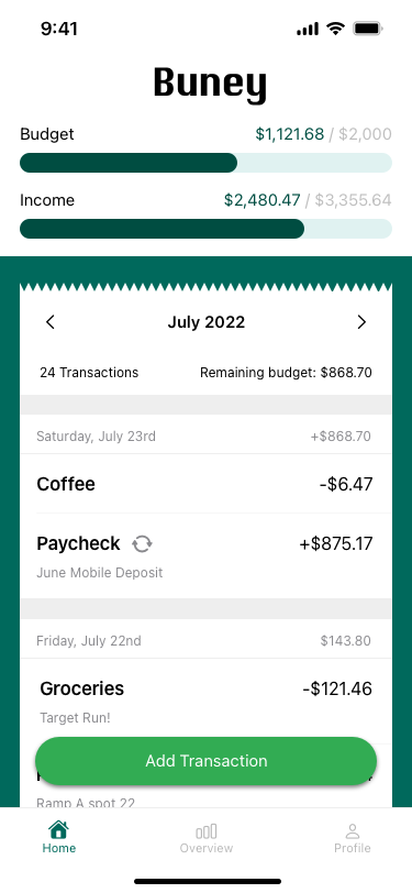
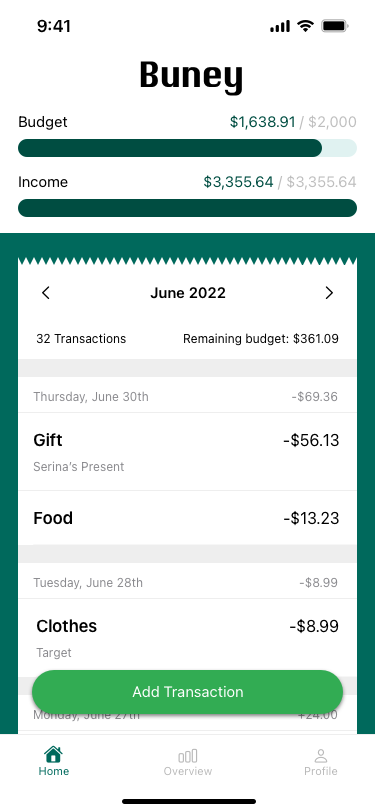
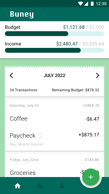
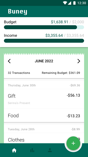
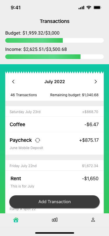
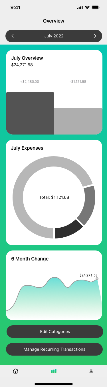
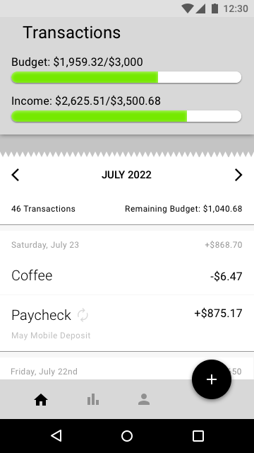
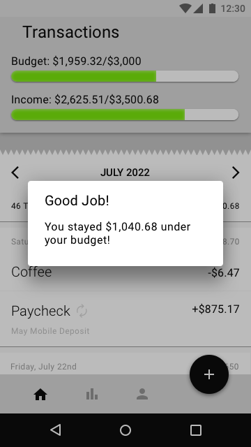
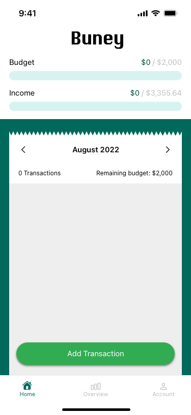
3. Increased contrast of color on the home screen income bar to make it more clear to users.
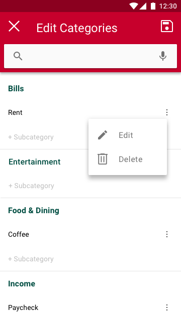
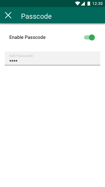
4. Added forgot password buttons to iOS and Material so users can do so if needed.
5. Added missing iOS home indicators to iOS Log in and iOS Create Account screens.
Other Comments
1.  “The way the list of transactions on the home screen looks like a recipt is clever”
2.  “the mint color background look fresh and well balanced in combination with the others”
3. A user liked the navigation bar with highlighted icons in white.
4. “I think it’s a cute name” (Buney)
5. “It is clear and minimal, I like that”
6. “I can really see how this can help me to be honest”
Prototype Links
iOS Prototype in InVisionMaterial Prototype on Sketch
UI Design
Final Wireframes
Mockups
Back to the top